At Milstein-Ravel, we believe that every pack is a story in itself: when it is well-designed, it becomes instantly clear, feels authentic, and is chosen without hesitation.
This conviction drives our entire approach: understanding that a package is not an isolated element, but the place where a brand becomes tangible, memorable, and emotionally significant.
Packaging is often the first point of contact between a person and a product. In seconds, it must convey who the brand is, what it proposes, and why it matters. That is why, behind every visual decision—colors, typography, gestures, images, materials—there is a strategy that seeks to translate the brand’s DNA into a concrete, visible, and cohesive experience. In this feature, we explore that very bridge between identity and design: how to turn a brand's essence into packaging that communicates with clarity, seduces from the shelf, and builds long-term value.
1. Brand DNA: the starting point for any packaging
Every brand has a core: a reason for being, a personality, a set of values, and a competitive edge. Before thinking about colors, typography, or shapes, the strategic process begins by answering:
- What does this brand stand for?
- What emotion does it want to evoke?
- What role does it play in the consumer’s life?
- What is its tone, attitude, and cultural universe?
This DNA is the filter that guides every visual decision. When it is well-defined, the design flows naturally; when it isn't, the packaging becomes generic or interchangeable.
2. From concept to form: decisions that build meaning
Every graphic asset is an opportunity to reinforce a strategic idea. Powerful packaging doesn't just accumulate elements: every element has a purpose..
- Color palette: It does more than differentiate categories; it expresses sensations (freshness, intensity, naturalness, premiumization).
- Typography: Conveys the brand’s tone and voice: approachable, technical, sophisticated, youthful.
- Photography and illustration: They build a world; they make the benefit tangible.
- Composition: Guides the eye, prioritizes what matters, and facilitates on-shelf legibility.
- Finishes and materials: They reinforce sensory perception (gloss, matte, texture, weight).
Nothing is decorative; everything is narrative.
3. Visual storytelling: telling a story in seconds
Unlike other media, packaging cannot be expansive: it must say everything without saying too much.
How is this achieved?
- By simplifying the message to its essence.
- By designing codes that the consumer understands instantly.
- By building a cohesive narrative across the front, back, and sides.
- By integrating symbols, gestures, or shapes that become synonymous with the brand.
Visual narrative ensures that packaging is not just seen, but recognizedIt speaks even when it isn’t being looked at closely.
4. Coherence: the common thread between identity and product
Strategic packaging does not work in isolation: it must coexist with the brand identity, its communication, its tone, and its digital experiences.
Coherence is what builds trust, recognition, and preference.
When design and branding speak the same language:
- The brand becomes more memorable,
- The product is perceived as more valuable,
- And the experience is unified from end to end.
3 Examples of this strategic translation in our own designs
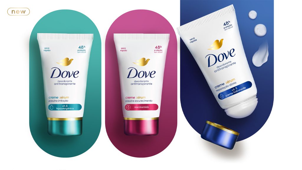
1. Purity + Well-being → ample white space, visual clarity, a sense of softness
For personal care brands and lines inspired by universes like Dove's, we work with light and bright palettes, clean typography, minimalist photography, and airy compositions. The objective is to convey softness, well-being, and honesty, aligning the design with promises such as hydration, simplicity, or everyday care.
These decisions are not merely aesthetic; they are strategic. Each one responds to a specific attribute of the brand's DNA.
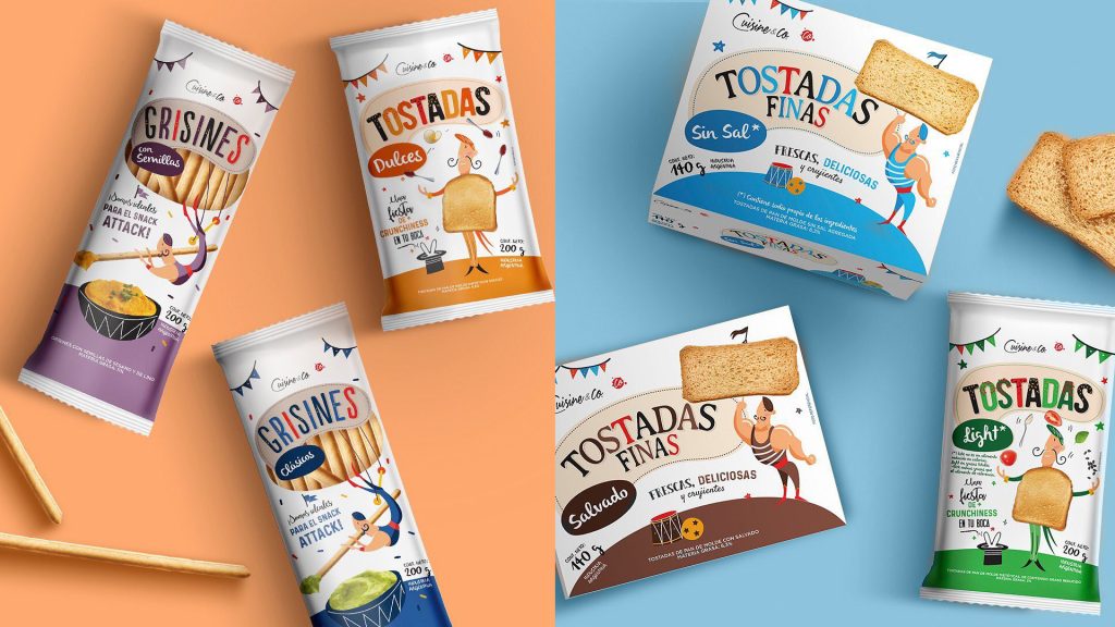
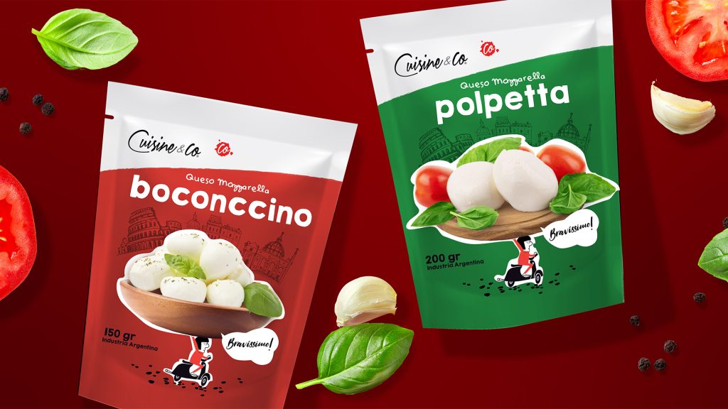
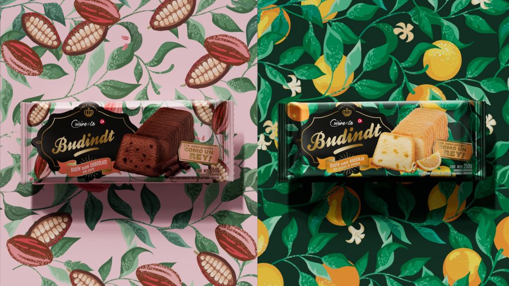
2. Youth + Fun + Irreverence → color, energy, and expressive codes
For younger brands with a strong personality, such as Cuisine & Co, the design relies on intense, vibrant palettes, photography or illustrations with attitude, and dynamic compositions. On-pack copy is used to build a relatable communication tone that engages directly with the consumer through humor, seeking to create a sense of connection and rapport.
This visual universe translates a youthful, disruptive DNA into packaging that captures attention on the shelf, tells a story, and expresses identity with freshness and wit.
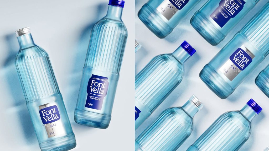
3. Trust + Transparency + Simplicity
For brands whose differentiators are origin, purity, and trust—such as the Font Vella universe—we work with blue color palettes and watery visual codes, a sense of freshness and transparency, understated typography, and stable, clear, and reliable compositions.
This visual language communicates quality, purity, and tranquility, conveying security through its very simplicity.
6. Business impact
Packaging that is aligned with the brand's DNA does more than just elevate the brand: it improves performance on the shelf.
Shopper marketing research shows that it:
- Enhances immediate recognition
- Increases brand recall
- Accelerates the decision-making process
- Reinforces quality perception
- Builds visual loyalty over time
A well-thought-out design sells, communicates, and differentiates—even without a major campaign behind it.
In short
Translating brand DNA into a pack is an exercise in strategy, sensitivity, and precision.
It involves listening to the brand, understanding the consumer, and designing with intention. At Milstein-Ravel, we believe every pack tells a story; and when that story is well-crafted, it is felt, it is remembered, and it is chosen..